Exhibitor News
-
) Visit Appliance Superstore stand at stand K100 and see this amazing new invention. See it, feel it, use it and fall in lhov!
Visit Appliance Superstore stand at stand K100 and see this amazing new invention. See it, feel it, use it and fall in lhov! -
) Visit Appliance Superstore at stand K100 to see the superb quality of 1810s sink and tap range.
Visit Appliance Superstore at stand K100 to see the superb quality of 1810s sink and tap range. -
) Visit Appliance Superstore at stand K100 to see just what makes Miele appliances stand out from other brands.
Visit Appliance Superstore at stand K100 to see just what makes Miele appliances stand out from other brands. -
) Visit Appliance Superstore at stand K100 to see this new technology, it really is a Grand Design!
Visit Appliance Superstore at stand K100 to see this new technology, it really is a Grand Design! -
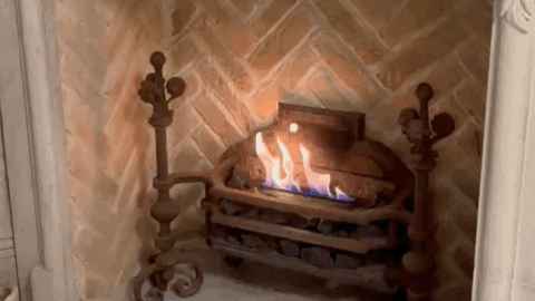
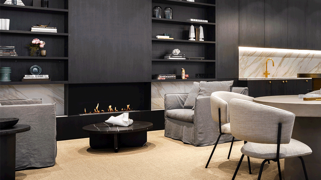 Flex Fireplaces - 378mm to 4m wide fires, 1, 2, 3 & 4 sided options. All without the need for a flue or ventilation, and all with great, clean burning flames.
 -
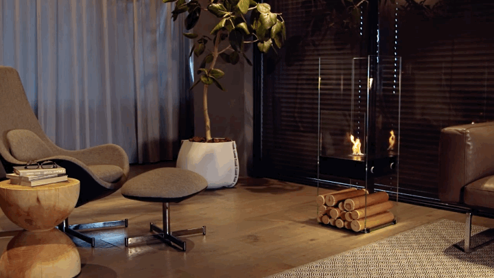 Gemini saidThe EcoSmart Ghost is a strikingly elegant, freestanding fireplace designed for ultimate versatility. Crafted almost entirely from toughened glass and high-grade 304 stainless steel.
 -
) Heritage buildings face mounting pressure to cut carbon emissions, but traditional solar panels often clash with their historic appearance and face public resistance.
Heritage buildings face mounting pressure to cut carbon emissions, but traditional solar panels often clash with their historic appearance and face public resistance. -
) The new four-bedroom house on a sensitive site in the middle of a village is clad in brick with timber-board facings designed to sit comfortably in the local context
The new four-bedroom house on a sensitive site in the middle of a village is clad in brick with timber-board facings designed to sit comfortably in the local context -
none
-
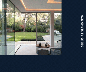
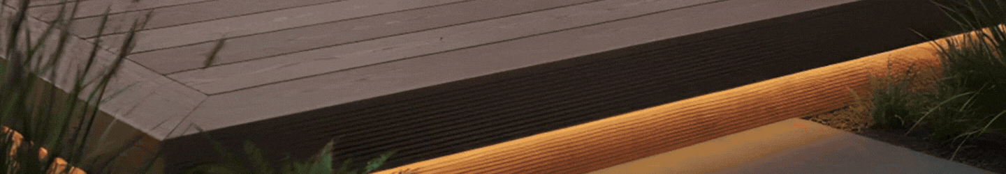
) Every project we undertake is unique. We work with architects, builders and designers to ensure each and every installation meets your individual requirements.
Every project we undertake is unique. We work with architects, builders and designers to ensure each and every installation meets your individual requirements. -
) Kembla Limited has been honoured at the West Midlands Energy Efficiency Awards as Solar PV Installer and Contractor of the Year 2025.
Kembla Limited has been honoured at the West Midlands Energy Efficiency Awards as Solar PV Installer and Contractor of the Year 2025. -
) This installation perfectly illustrates how solar PV seamlessly integrates with modern design aesthetics, proving that solar energy is more than just a technical upgrade—it’s a lifestyle choice.
This installation perfectly illustrates how solar PV seamlessly integrates with modern design aesthetics, proving that solar energy is more than just a technical upgrade—it’s a lifestyle choice.
)
)
)

)
)

)

)
)
)

)